Being a Midwife for an Interface Pattern Library
Challenge:
A visually outdated homegrown application world that was mainly built by developers, with very little user feedback, needed a unifying design.

Approach:
With a scrum team of five create the initial step for an interface pattern library, based on a specific software, with the user-centered design methodology.

Contribution:
UX Designer and Team Lead.

Year: 2015
Situation
One of Germany’s biggest retailers was working on updating its IT infrastructure. The frontend needed to be modernized, and the management wanted to introduce a more user-centered design approach to the company. A team of a frontend engineer, scrum master, visual designer, me as the senior UX designer and internal team lead (for the nexum team), and a product owner from the retail company were tasked to tackle that problem. Due to a shortage on internal personnel, the scrum master and the frontend developer were external.
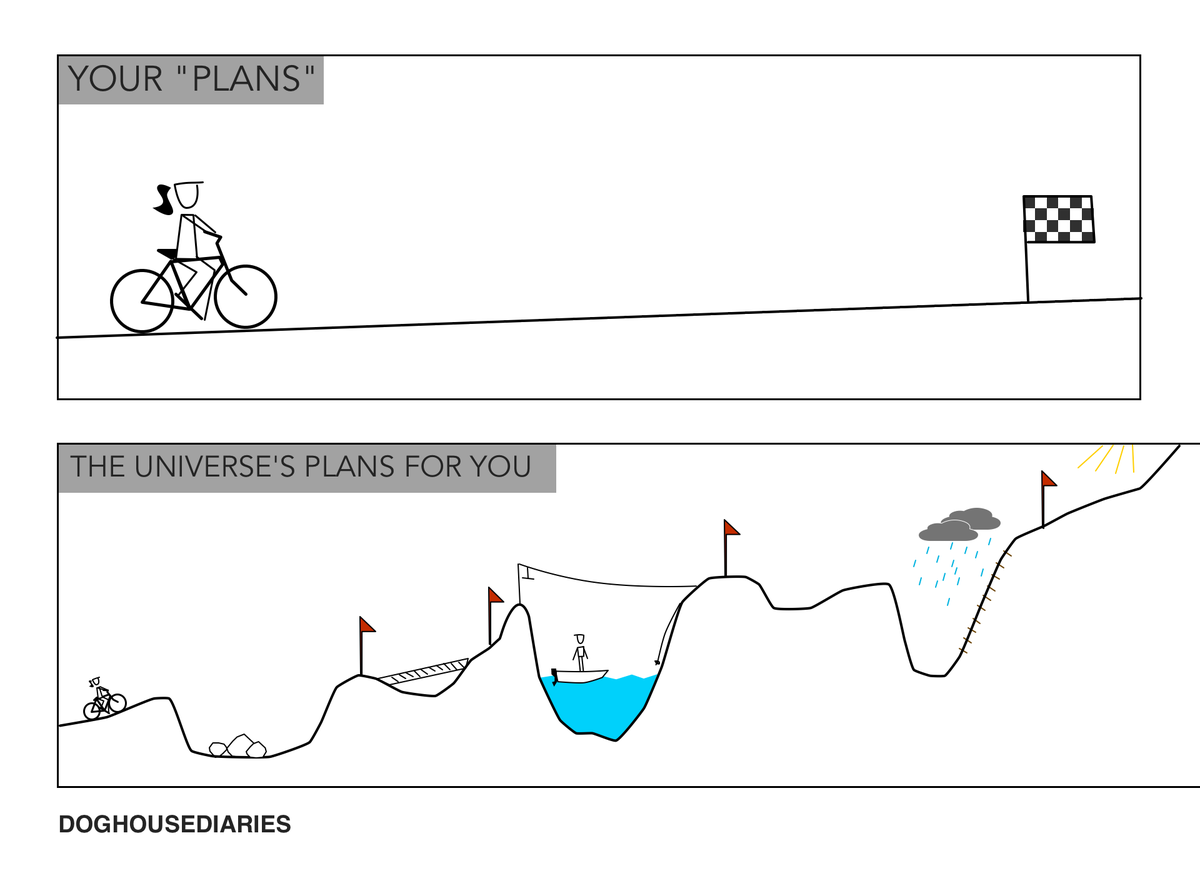
Planning vs Reality
In this case study, I want to show some of the facts of real life. Projects can be planned beforehand, which is what you should do so you can allocate people and estimate costs. But reality very often challenges that plan.
Approach
The application world of the company was very big. One approach could have been to analyze the whole system and try unifying it with a pattern library. This approach is very time-consuming. Big projects not only take time, but the outcome is uncertain. Therefore, the choice was to focus on one singular software that was used in the retail stores and try generating a North Star. We would not only restructure and design the screens, but they would be presented as a working prototype with real data.
Agile & Peer Review
The project was set up as a scrum project. This was due to the way the HQ already was organizing their development process. Our plan was to be a satellite in the beginning, then later be integrated into the scrum processes in the HQ. One element of our agile process was the peer review. One consultant had a 30-minute meeting with the team at the end of the week, looking at the current results. It was a great help as it enabled the team to get an external opinion. Decisions were questioned and designs were critiqued in a constructive way. The team and the project benefitted a lot from that.
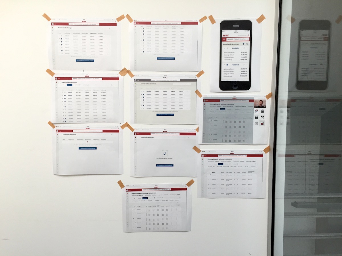 Designs and wireframes being peer reviewed
Who Are We
There is a great article by Oliver Reichenstein from Information Architects, “The interface of a cheeseburger”. It talks about how you can look at an interface. I think for a team working on digital products it is always important to know what they represent with their interface. So, this is why we asked ourselves this question. The interface of all these applications in the market is the digital interface that connects the store with the headquarters. So, the headquarters is sending a message with this channel that they are providing. The look and feel of an interface should reflect how the headquarters views its stores. So, we boiled down our vision statement to this sentence:
“We are the message that the headquarters sends to the stores.”
Our goal was that this message be a delightful message that respects the user as a human being by making the user interface not just look good, but also a pleasant experience.
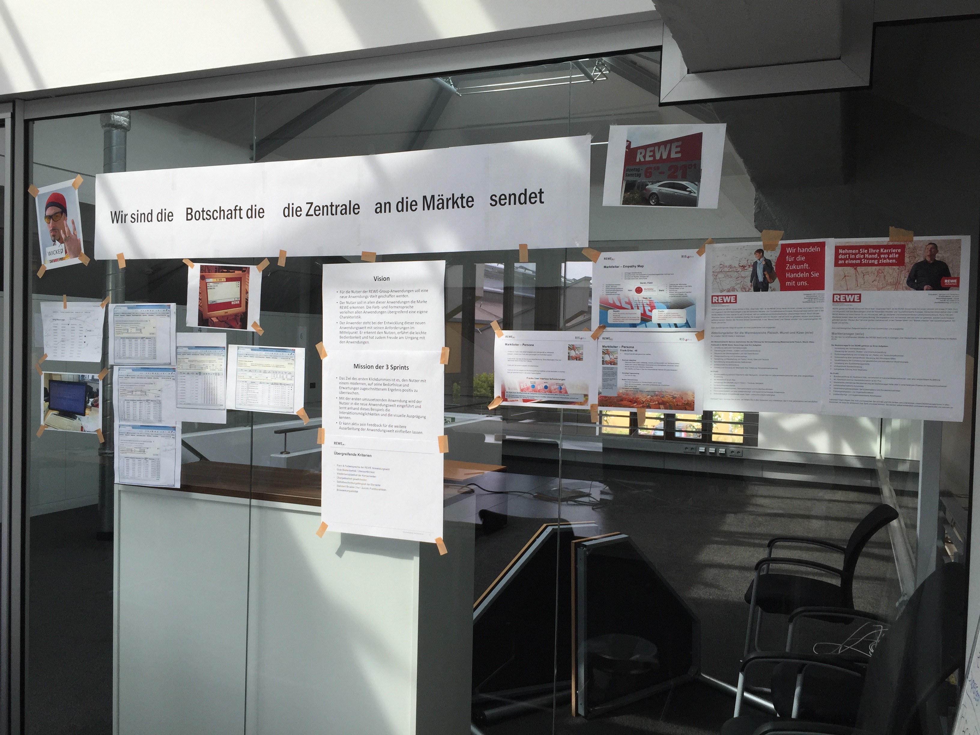 Our war room with our vision statement
Sprint 0
Planned: 1 × 5 days
Reality: 1 × 3.5 days
The goal of sprint 0 was to get the team together and to figure out what we want to do and how we want to do it. We were briefed on how the software was used in the stores. Since this briefing was done by the developers, we wanted to get to know how store owners or the service people from HQ use the software. So, we started arranging appointments. Together with the product manager and input from the team, we thought of questions that we would like to ask our users. I started researching other interface pattern libraries and documentations. I also sketched the first screens. The frontend engineer started setting up his system. And we did set up our ticket system. And we came up with a draft concept for how code and design could be documented together. At the end of the very short sprint, we presented the outcome.
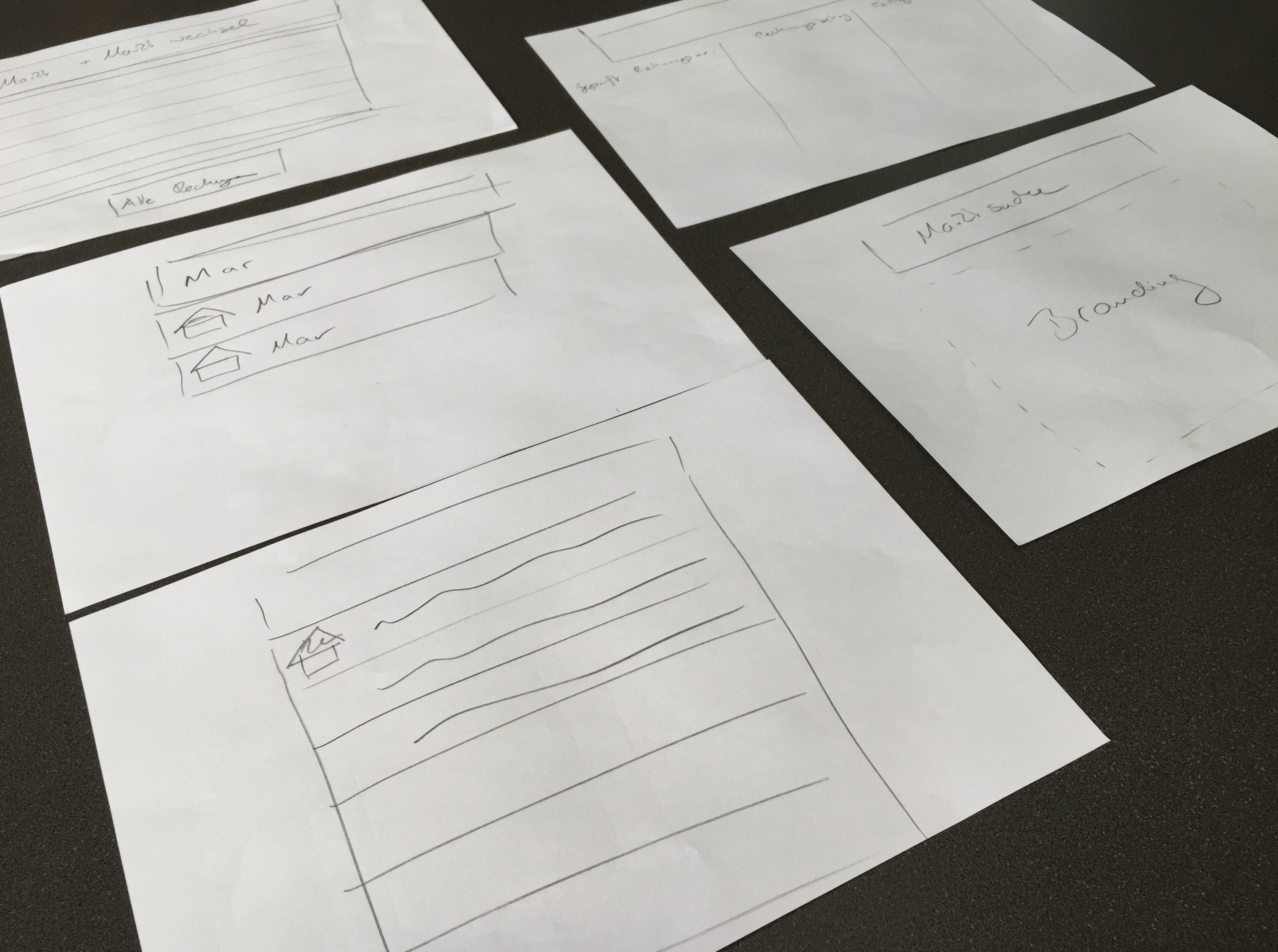
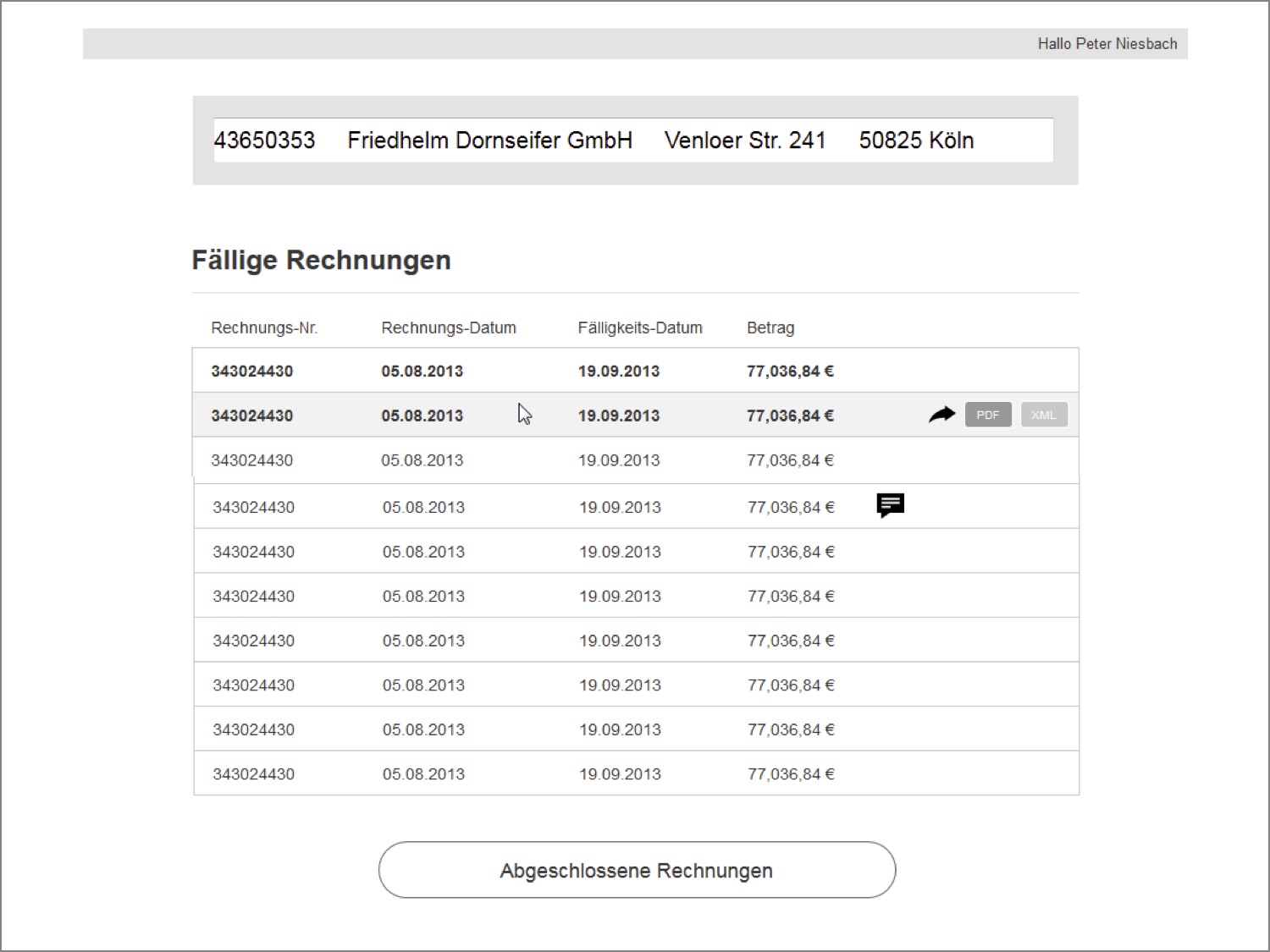 The first scribbles and wireframes after the resarch
Sprint 1
Planned: 2 × 5 days
Reality: 2 × 4 days
In sprint 1, we were able to reach out to two users. We interviewed one store owner in his retail store, which gave us some impression of how a store owner also was running his store. The other user we interviewed was from the Helpdesk in the HQ, who supported store owners with the software. This interview was conducted via telephone. Those two inputs weren’t enough to assume that we had gathered enough data, but they nevertheless gave us a good impression that there are very diverse needs to that interface and that those need to be taken into account.
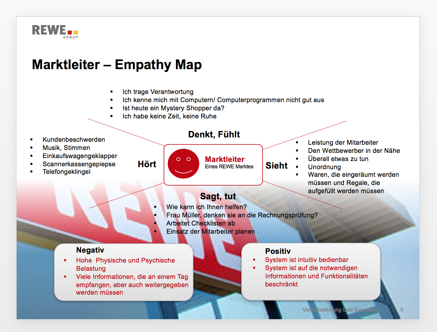
As our “client” was the store owner, we chose to generate an empathy map so we could bring that persona more into the center of our project. With the feedback from the store owner, I worked on the wireframes for the next sprint.
Wireframe the Designs
As this project was very short, the time for design explorations was very tight. The visual designer, who also was working on another project, didn’t have the time to try out several versions. I offered to make the wireframes more like a design to explore another visual approach. The two design versions were very helpful in this starting phase, and were discussed constructively in the peer review.
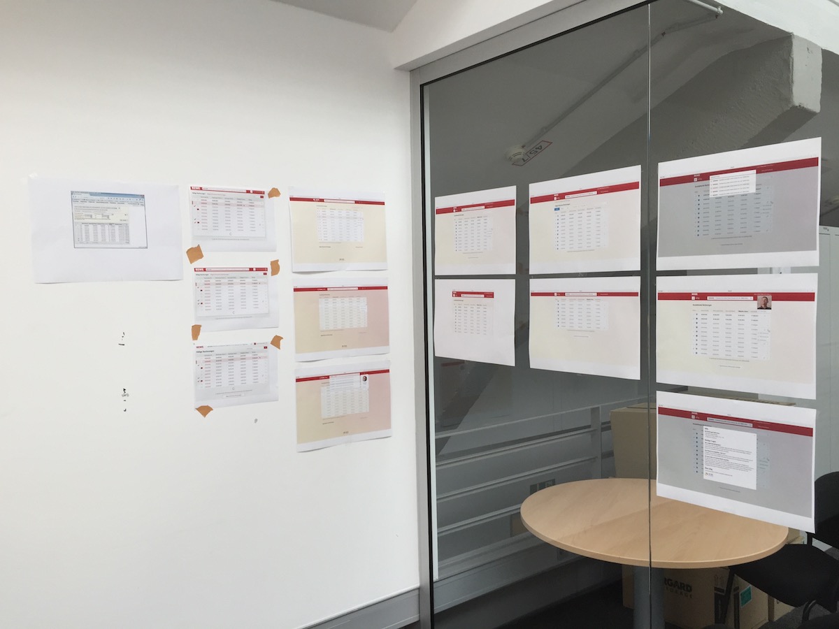 Our first peer review
It was a very collaborative environment as we all were sharing one room and showed each other results or discussed solutions to problems that we saw.
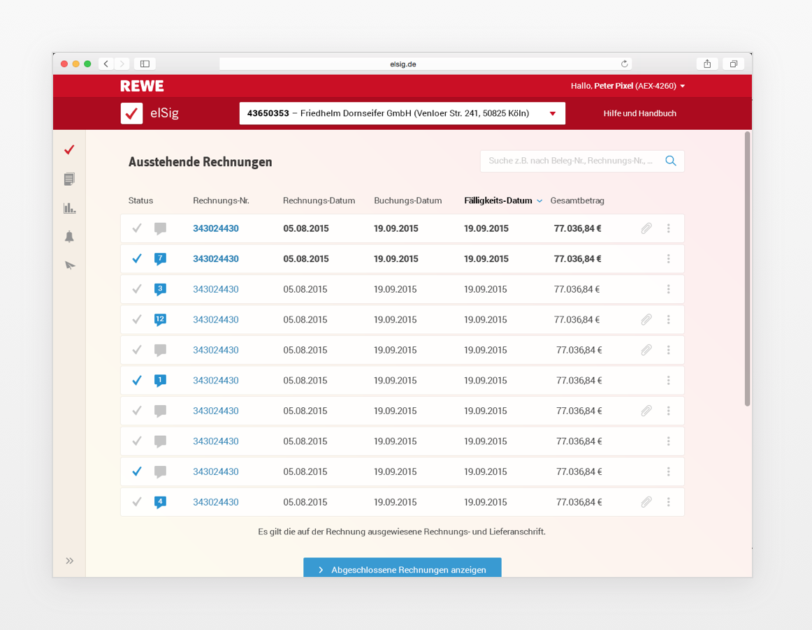 Designs from 1st sprint
At the end of the sprint, we presented the results at the headquarters. We got valuable feedback that we took with us for the second sprint.
Sprint 2.1
Plan: 2 × 5 days
Reality: (1 × 4 days) + (1 × 4 days)
This second sprint was a challenge. In the first week, I got sick and missed three days, and in the second week the product owner had a planned holiday and was going to miss that part of the sprint. Therefore, we split the sprint into two parts, with two presentations at the end of each week. With the feedback from the presentations, the visual designer reworked the designs and made the appearance more professional and showed that the design concept was skin-able. Though I was not around, the wireframes I had generated in the first sprint were the basis for the work of the visual designer and the frontend developer in the first part of the second sprint. At the end of the week, we presented the results. The feedback was very positive. Our task for the next part of the sprint was to finalize what we had built and to document it.
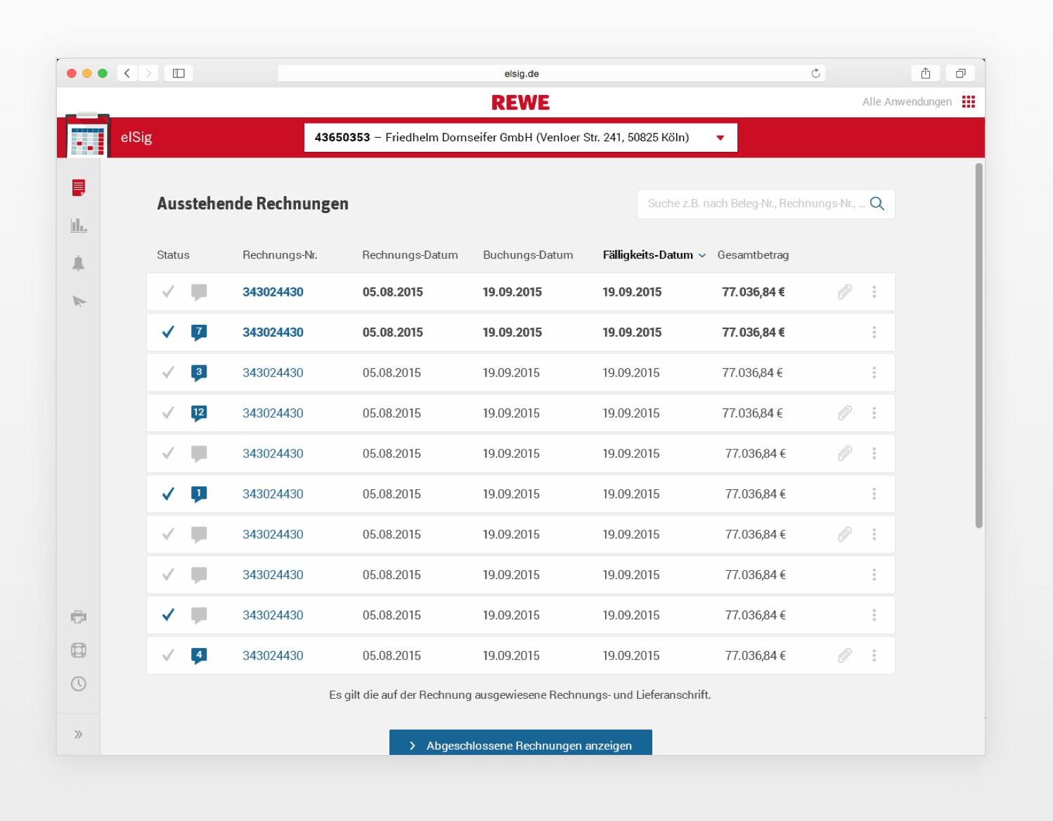
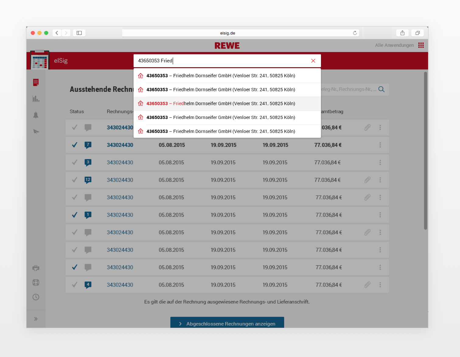
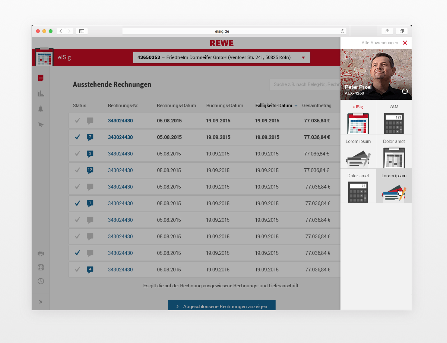 Designs from 2nd sprint
Sprint 2.2
In the second part of the sprint, the visual designer and I built a system for documenting the pattern library. We separated the documentation into sections:
- Colors and Color Usage
- Grid
- Screen Structure
- Icon Concept
- Typography
- Skinning
- Tables
- Filters (First Pattern)
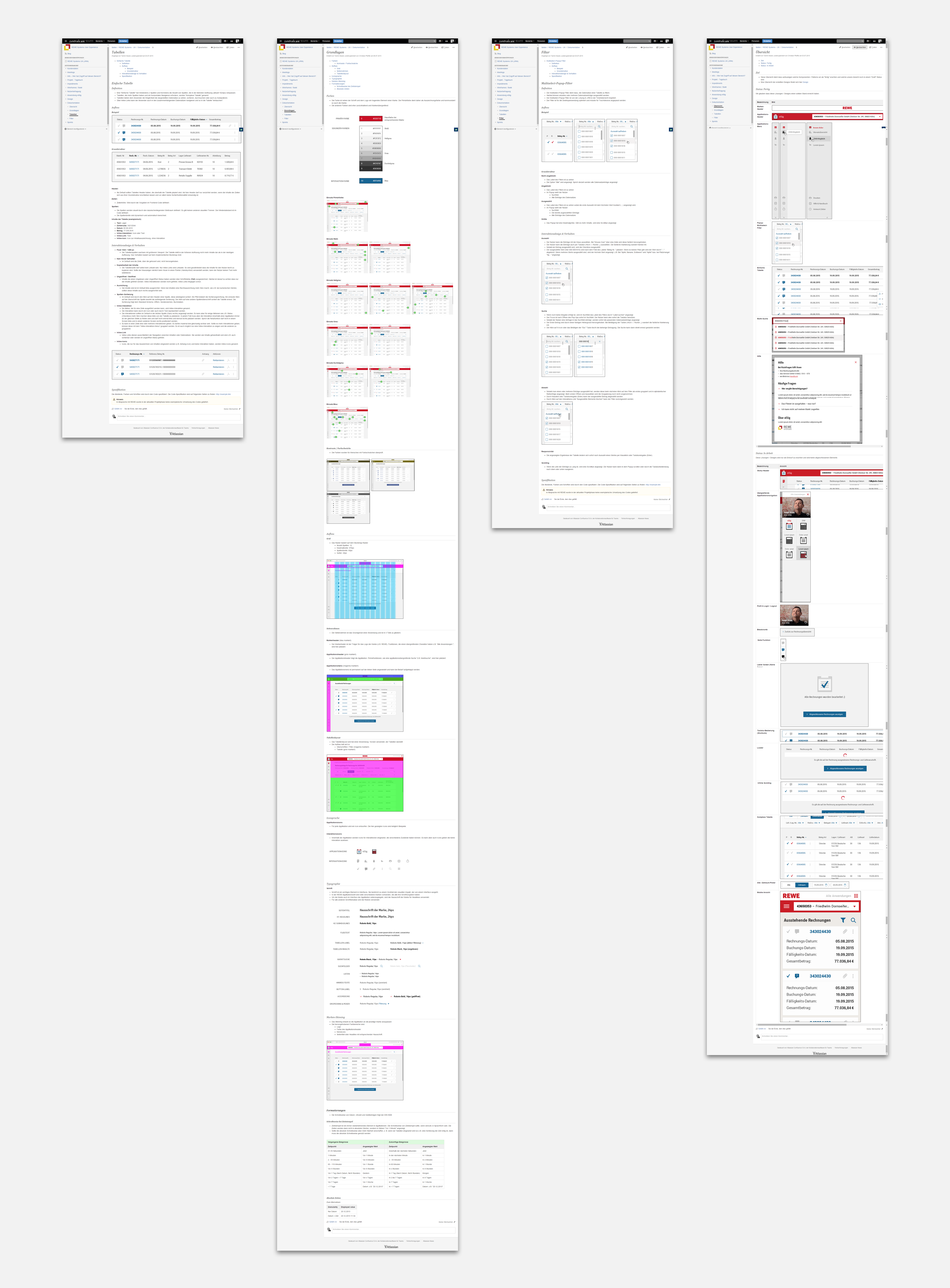 Overview of the documentation
The frontend developer worked on finalizing the working prototype. At the end of the week, we presented the final result in the HQ.
Retrospect
Putting the user in the center in B2B software environments can be a hard task. It’s not easy to get the feedback that is needed. And it’s not easy to restructure a developer-centric organization that had little to no direct connection with the user. But the client tried, and provided a good example of what can be achieved if the will is there. The client was very satisfied with the results and it was a major learning experience.