Learning Bit by Bit
Challenge:
Users don't know which kind of voice commands they can use.

Approach:
Design workshop with the engineer and implementation.

Contribution:
Researcher, Workshop Organizer, Product Designer

Year: 2017
The Problem
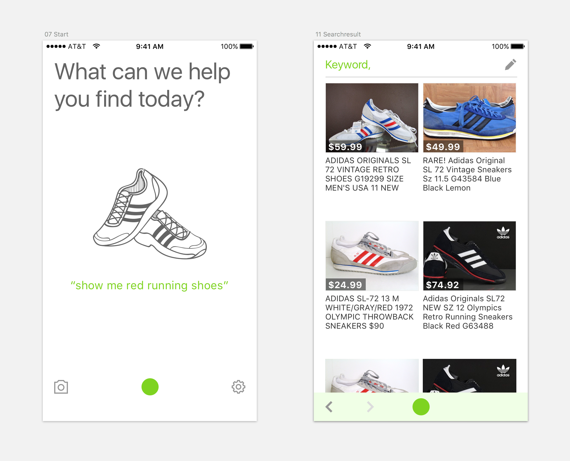
When we showed DIVA to others, we always needed to show the features that DIVA was capable of doing, such as “Search for price range” or ”Search for attributes”. The users said, “Ah, you can do that”.
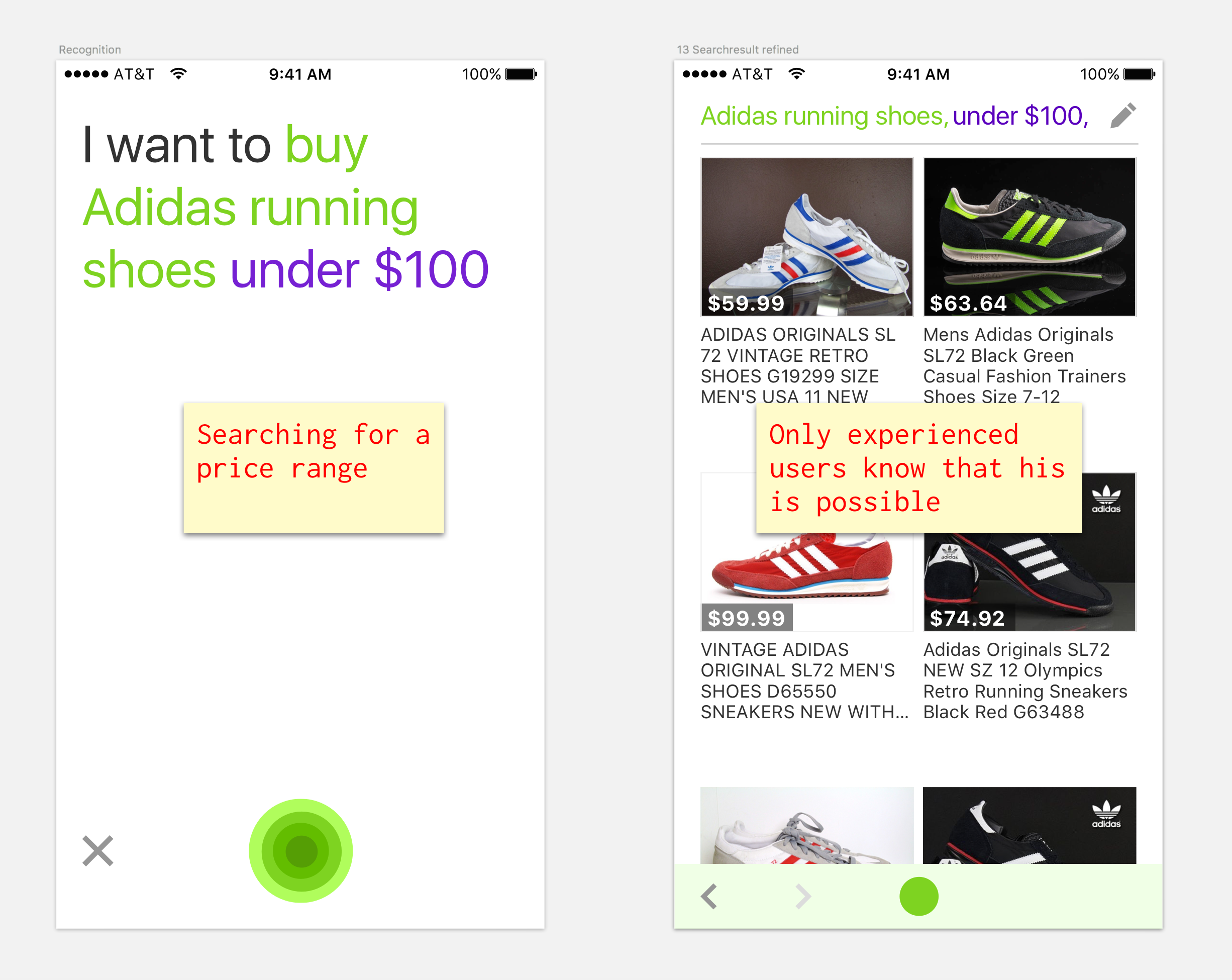 No hints that teach the user what she can say
In visual interfaces, features that are important can be consistently shown. The user sees the feature. There is an external signal that reminds him of it. For example, if you search in a e-commerce website, you can see the filters, or when you type the keywords, suggestions will be shown, with autocomplete for each new letter that you type. Features of voice interfaces lack that ability. The question is how can the user be shown what capabilities the NLU has without making tours that everybody dismisses and nobody watches.
Workshop
DIVA has a display and is not a voice-only interface. There are quite a few similar voice assistants out there. All of them have the same problem and take slightly different approaches to solving it. Since this was a good problem that can be discussed in a workshop, the iOS engineer and I teamed up together.
First, I collected screenshots from all the other assistants and printed them out:
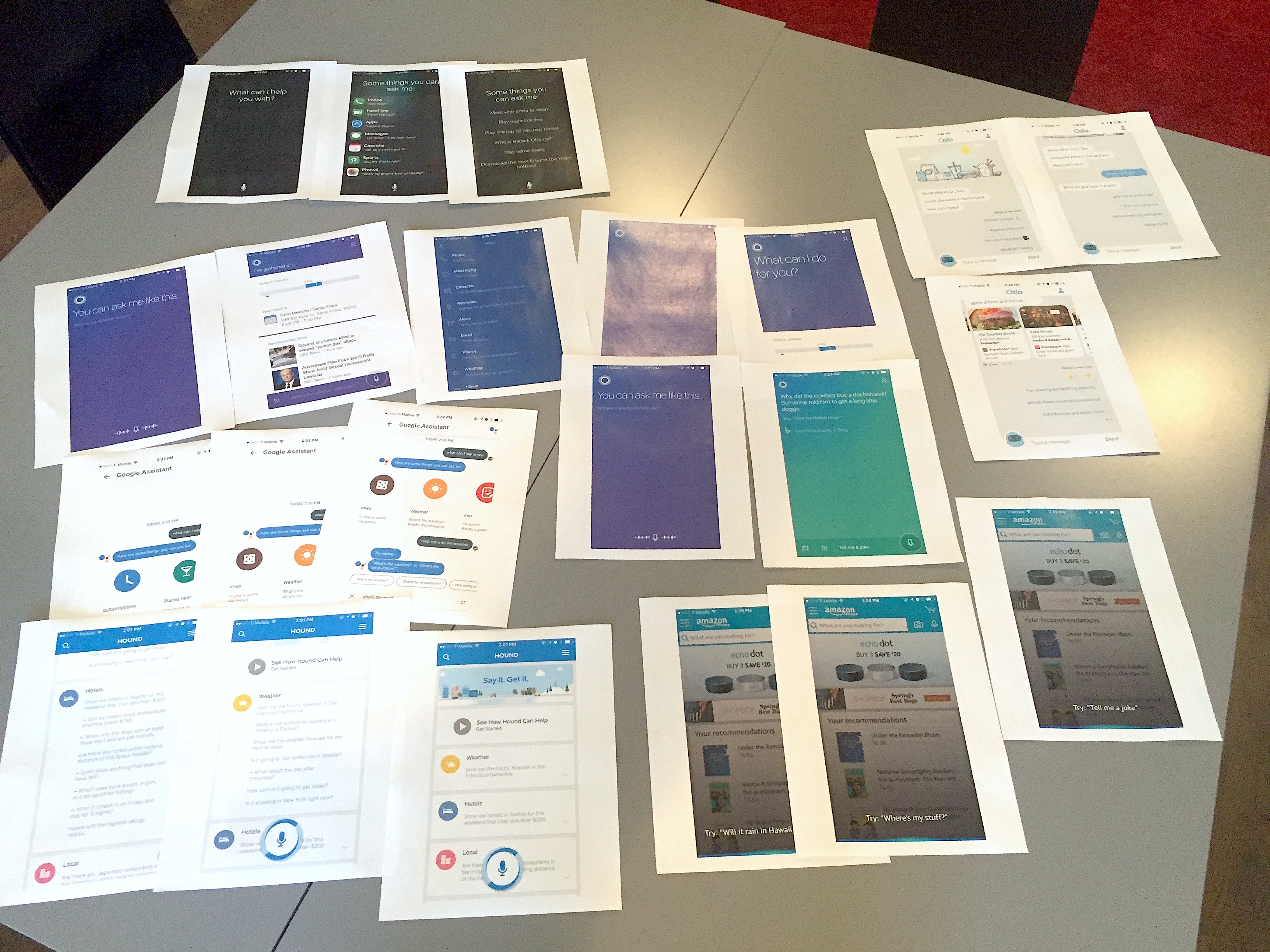 Cortana, Hound, Siri, Google, Ozlo, Alexa
We went through all the different solutions and discussed the pros and cons of each. We figured out the interaction patterns that were used in all solutions and decided together what could work for our case, or if we could come up with a better approach. We preferred when the information was minimal and not in a list form.
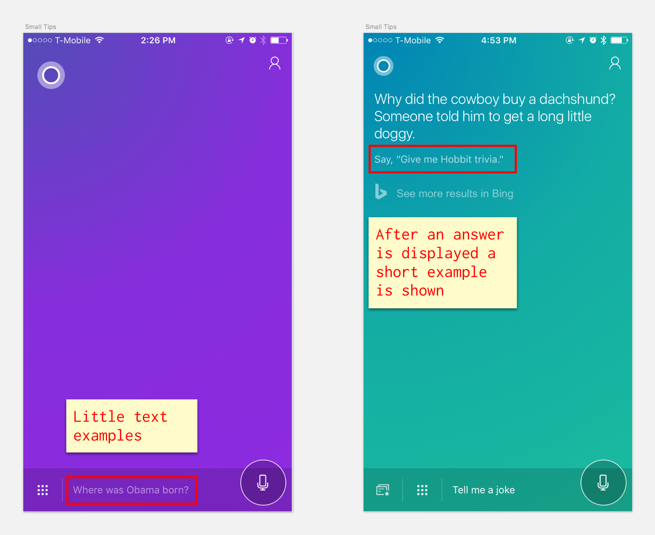 Cortana uses small hints here and there
Another thing we liked was when a skill was visualized as an icon.
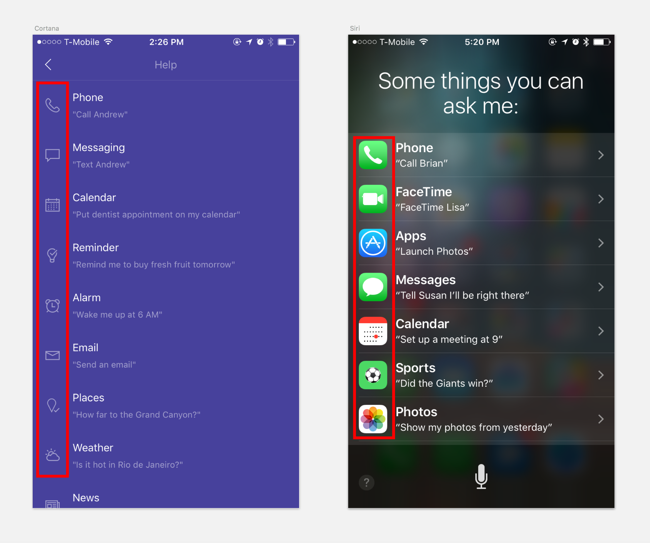 Icons visualize skills better than just text
We felt that giving the user the information in small chunks of teaching would be the best approach. We had two opportunities to do that, the start screen and the product list view screen. We sketched on the printed-out screens how and where the visual-nuggets could be placed and what we would want to teach the user.
 Screens where we could show the small nuggets
On our start screen we already had one example with a picture. We thought of having different visual examples that show different voice commands. And on our product list we could place small little examples on the bottom of the page.
Design & Prototype
I went straight to Sketch with the ideas and came up with different solutions. There was a back and forth between me and the engineer in Slack. The start screen looked like this:
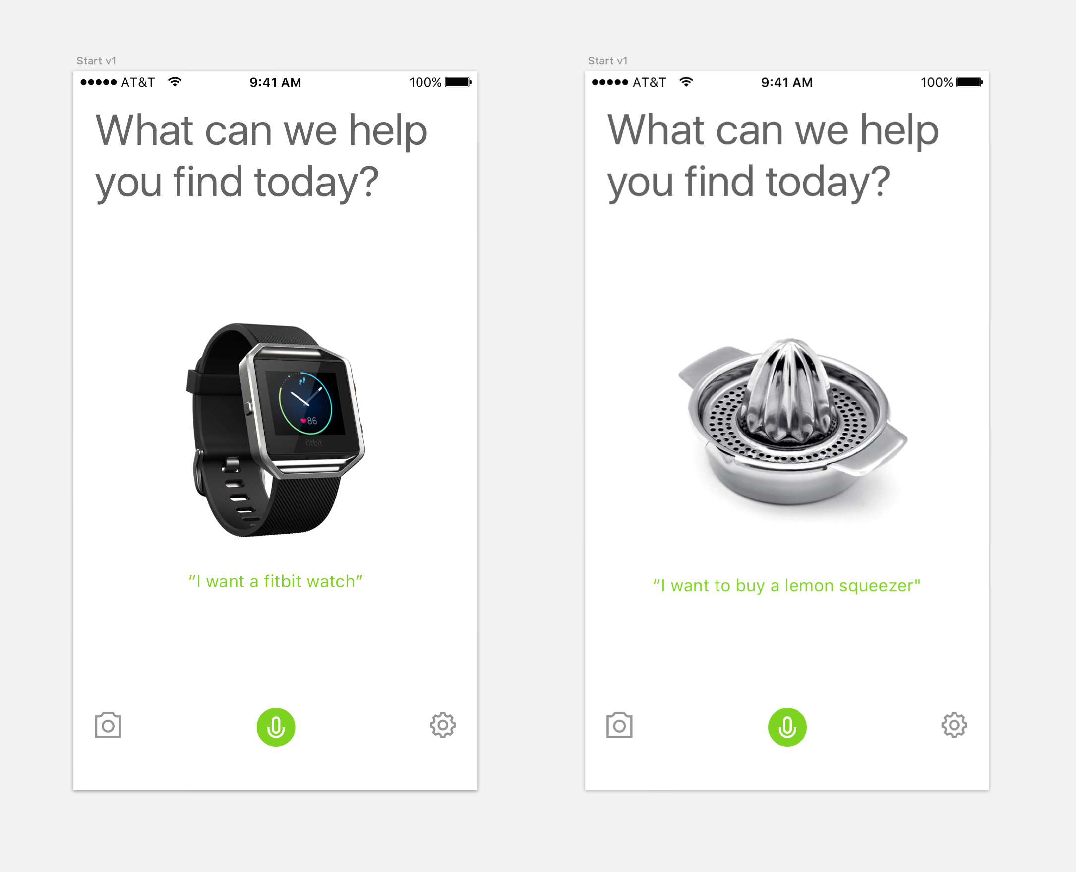 V1: The high res pictures were too distracting
The start screen with the high-res images was too distracting and too concrete. It felt like advertising and the speak button wasn’t as prominent as before. So, I changed the images to very simple icons that I found on thenounproject.com. That way they looked more like examples of searches. To show the variety we used different examples with different text attributes, searching for color or price that changed randomly.
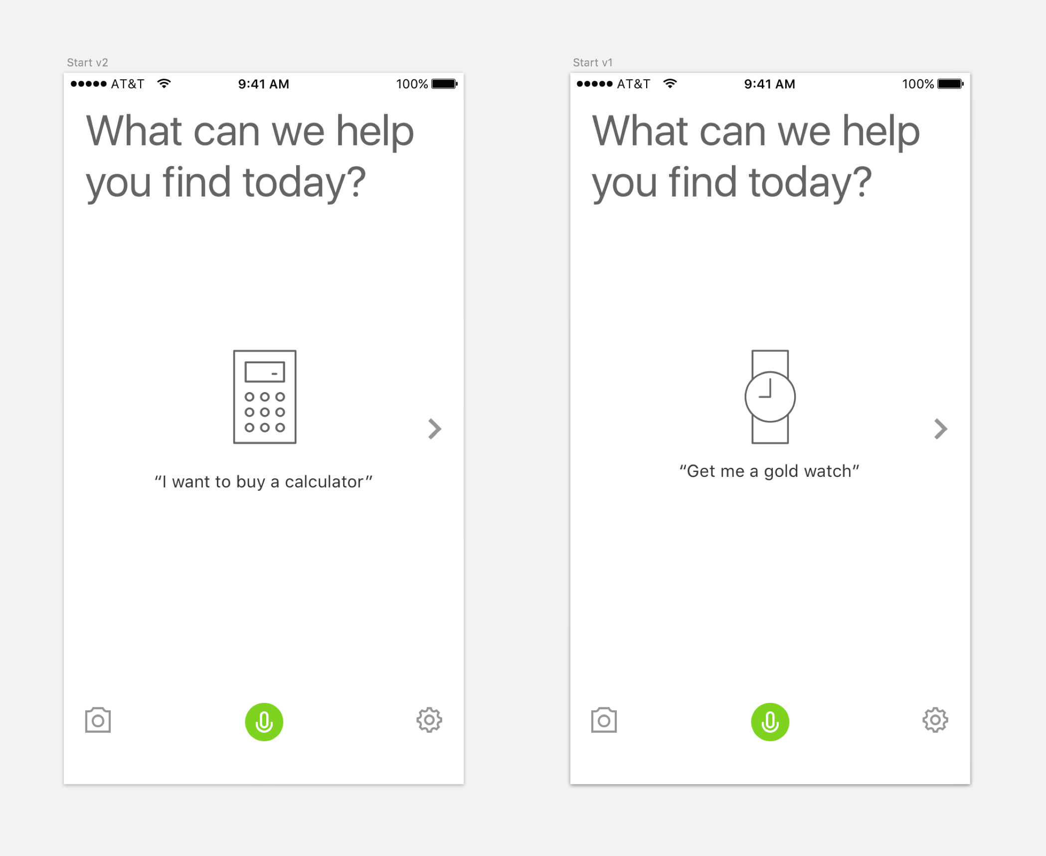 V2: Simple icons worked better as examples
The other opportunity to teach the user was the product list screen. To give the text-nuggets more space, I placed the microphone button on the right side. But looking at it together it didn’t feel right. So, I worked on making the text shorter and placing the microphone button in the middle.
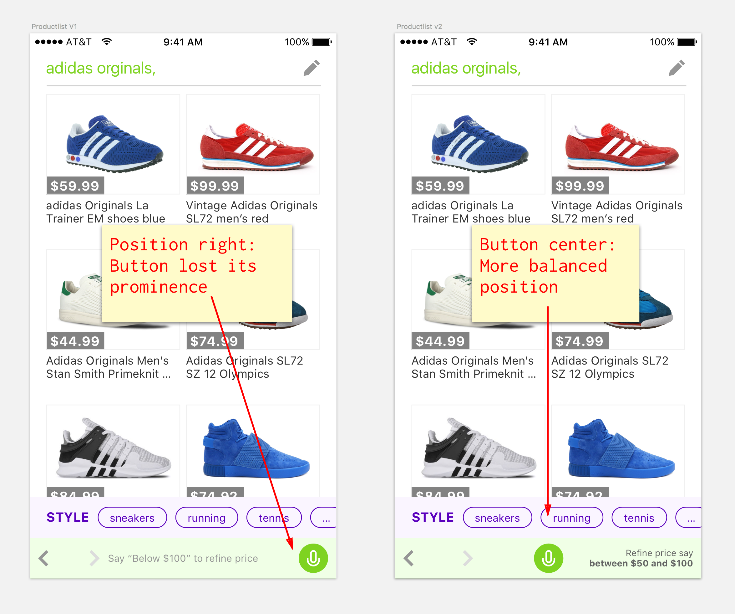
The second version felt like the better approach. We also had ideas to make the suggestions relevant to the first question. Implementing this “intelligence” would be possible, but would cost us more time and resources from other engineers. Therefore, we decided to push that update through and implement the intelligent part later.
Retrospect
By doing a quick design workshop with the developer we were able to look at the problem as a team. Analyzing the problem together is not just more fun but can help to see the problem through each others eyes. Though we didn’t have the chance to test the results in user tests we felt that the solution was an improvement to what we had before.