The E-Commerce Voice Assistant
Challenge:
A small remote team using the company's speech recognition software and NLU technology to build DIVA, a Siri-like e-commerce system, from scratch.

Approach:
Build, test, learn, build, freak out, learn, persevere, learn,…

Contribution:
Product Designer & Product Manager: Trying to keep a balance between my inner drive for perfection as a designer and my pragmatism as a product manager.

Year: 2016 - 2018 hihi
Situation
AppTek is a speech recognition company that licenses its speech recognition engine to its clients, tailored to their needs. AppTek is a strong believer that voice will be the primary interface for consumer computing within the next few years. So the company decided to offer a voice interface platform for e-commerce companies powered by their speech recognition and natural language understanding technologies. The outcome should be a platform that would make it possible for other e-commerce companies to offer voice-based services in their interfaces (web, mobile). To showcase the capabilities and to develop the platform, we built a shopping assistant called DIVA (Digital Intelligent Voice Assistant).
Challenge
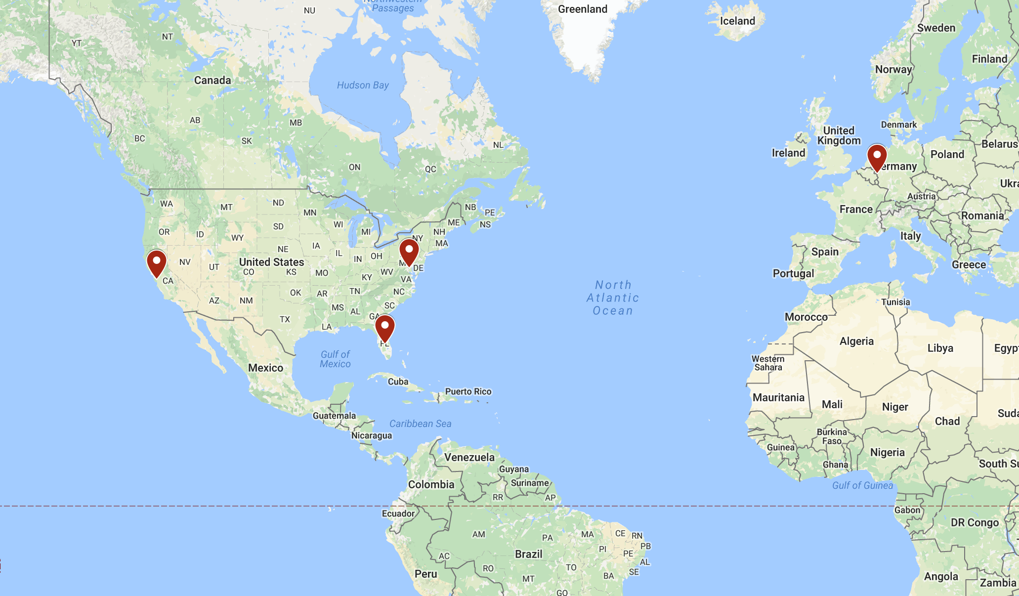 The remote team in 3 different timezones
The input I received was, “Think of HAL 9000 or Jarvis and make that for e-commerce.” HAL 9000 and Jarvis are fictional intelligent assistants from science fiction movies. The theoretical possibilities were endless. The previous products that AppTek built were more B2B applications. The company’s own speech recognition was just recently enabled to stream the transcription back via the internet, which made the voice assistant possible in the first place. The team was scattered around the world (US East & West Coast & Germany). Most of the team members were only partially dedicated to the product. As the new product manager and designer, I only had the chance to meet part of the team in person, and I had no prior experience working in the field of AI or voice interfaces.
Our Team
The DIVA project team consisted of 6 members.
- 1 × iOS engineer
- 2 × backend developers
- 1 × speech recognition scientist
- 1 × NLU scientist
- 1 × QA manager
- 1 × me
Organizing the Team
To keep the team in sync, we met twice a week in a telephone conference and once per week in person with all the team members on the US West Coast. To avoid filling up our email inbox, we chose Slack. The team already was using JIRA. Since it integrated well with other Atlassian software, we choose Confluence for documentation.
Creating the Vision
The first thing was to figure out what we wanted to build. This was done in the first phase of the project and is described in the post: “Creating a Vision & Telling a Story”.
Keep Developers Closest
There is a saying made popular in the Godfather movies: “Keep your friends close, and your enemies closer!” and I would add: “and your developer closest.” Computer engineering is a profession that automates things and renders away redundancy. Designers generally can generate their designs quickly, and are therefore more open to changing things once they see they don’t work. Those changes for the developer often mean “redo the work you already did,” which can be annoying. Though it’s good to embrace a culture of change, that culture shouldn’t be stretched. To avoid that as much as possible, my goal is always to integrate the developer early in the process and to prepare the work toward him/her. I also like to have direct access to the code via a repository setup. This way I can do small incremental changes to text, animations or colors myself without bothering the developer. That also shows empathy from the designer toward the coder, and can generate a better bond between the two.
First Working Prototype
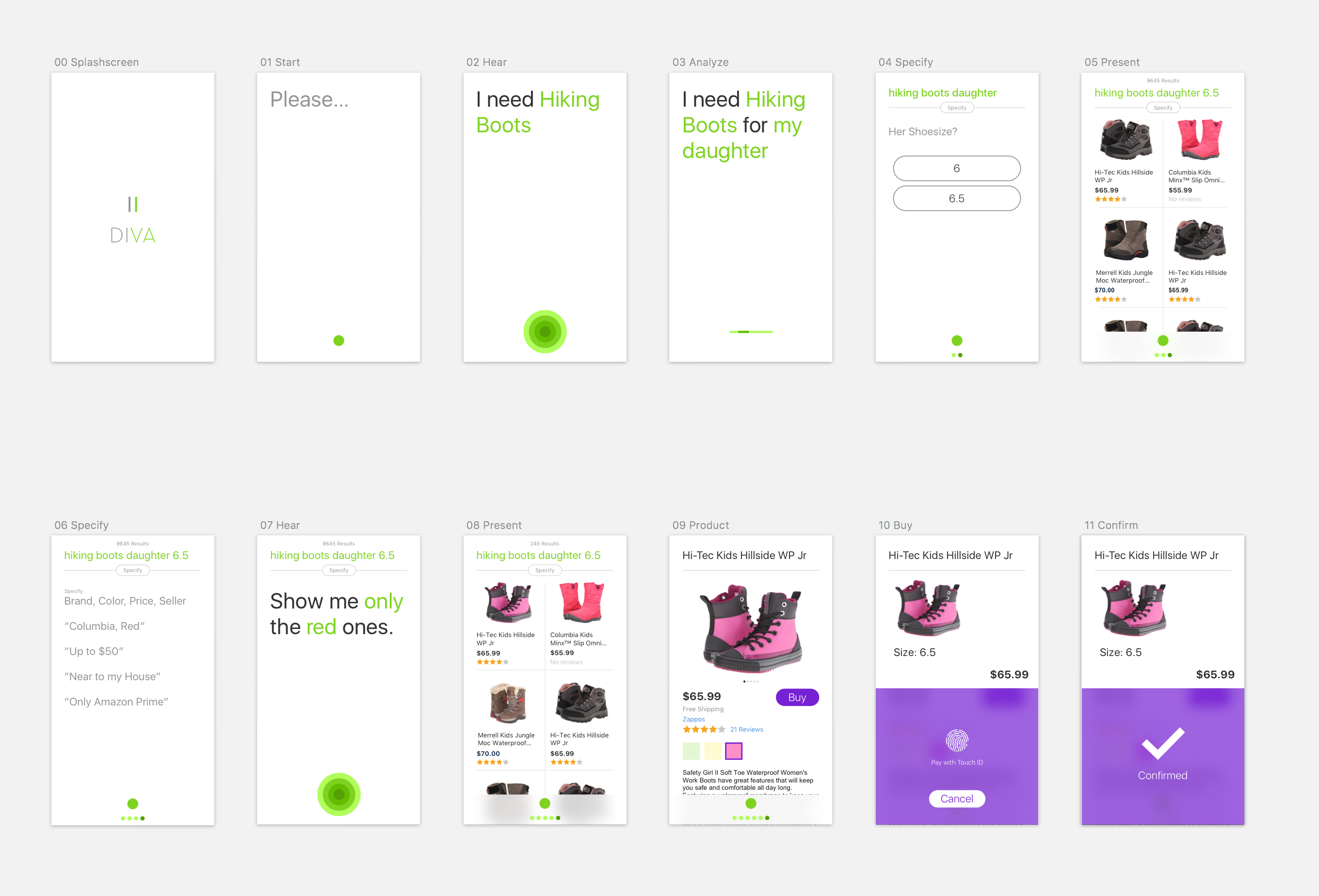 A simple prototype to tell the story
The first click prototype was designed for the user story. By building that interactive prototype, we had a couple of screens, colors and a design direction that we had checked out. The next step was to make the prototype real. As quickly as possible. To make a prototype app with a working speech recognition and language understanding, the team had to gather training data from the internet to create the needed models for interpreting the search queries and to improve the speech recognition quality. We decided that at the beginning we wouldn’t connect to an e-commerce API, but build our own product database connected to a Lucene search. That way we could act more quickly and were not dependent on other infrastructures. Meanwhile, the iOS engineer and I teamed up to bring the design prototype to life. After three weeks, we had the first working prototype in place that searched on our product database.
What you can see in this video is that the speech recognition isn’t very accurate. The reason for that is the improvements to the speech recognition weren’t in place yet.
Speed
When the tech was in place, we saw how slow our speech recognition was. There were several reasons for that. If you want to read how we tackled that problem, read: “Team, We Are Faster than Siri!”
Highlight what you Understand
For an AI based on voice recognition, two technologies are important:
If you say: I wanna buy … running shoes
- An automatic speech recognition (ASR) service that transcribes what was just said.
- Text: I want to buy running shoes
- A natural language understanding service (NLU) that extracts the correct intent and understands it.
- intent: buy
- object: running shoes
Some voice assistants don’t display the transcribed text at all, and just extract the relevant word.
Other assistants – like Hound, Siri, Google Assistant and Cortana – do transcribe the text.
We felt that showing the text is better than hiding it. Showing the text is a signal to the user, “I’m listening to what you are saying.” To emphasize that signal, we wanted to add another form of visualization. Therefore, we colored the intent and the object green, showing the user “Yes, we understood exactly what you want to do and what you are searching for.”
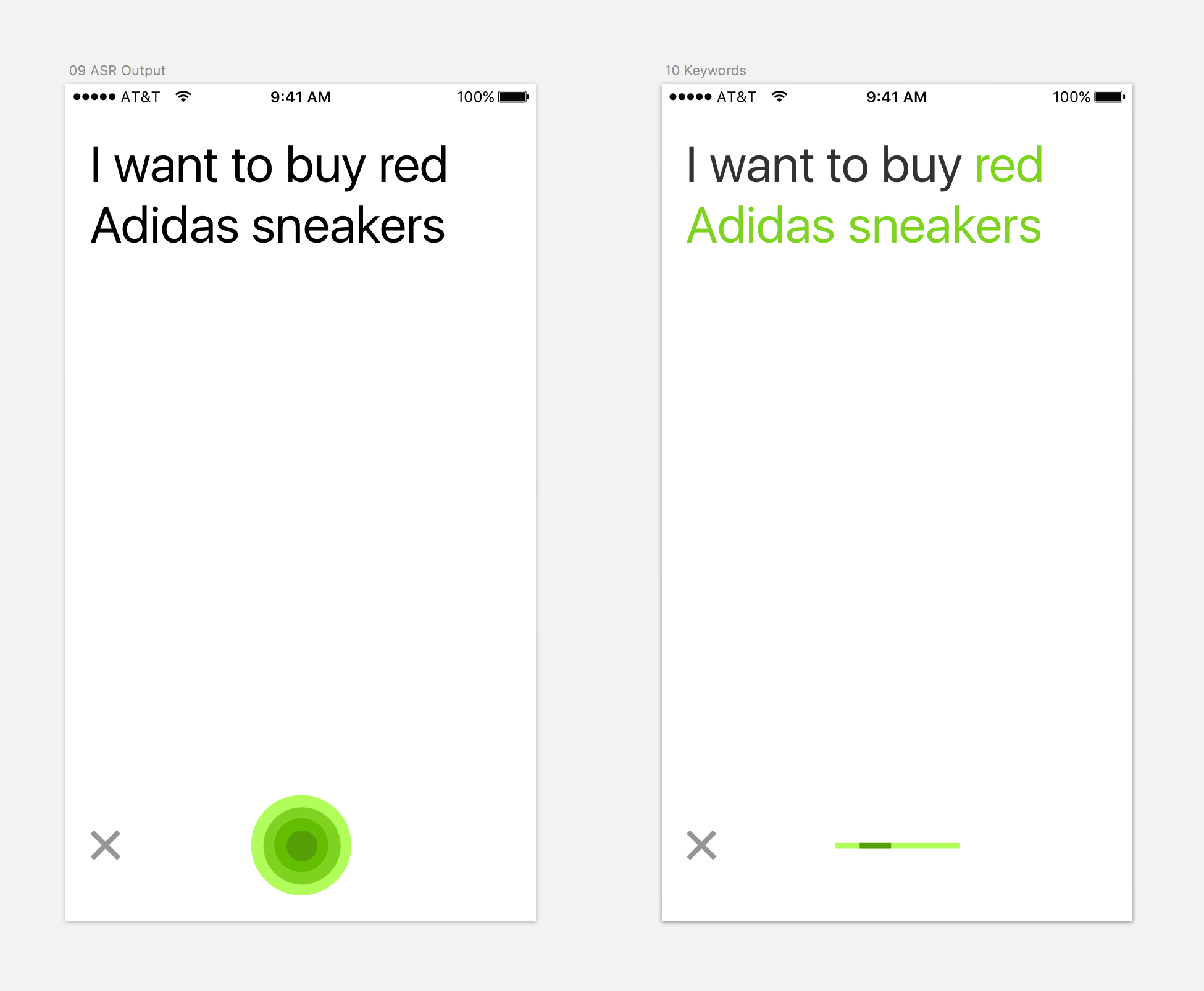 Highlighting the object in green
Later in the project, we also decided to push the color-coding paradigm further, and gave the refinement another color. That way the object and the refinement would be distinguished visually.
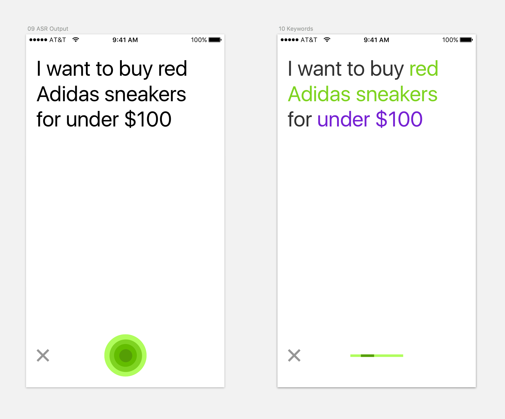 Highlighting the refinement (Feature is partially integrated in Downloadable App)
Improving the Speech Recognition
When we started with DIVA, the speech recognition models in use at the time lacked the optimization toward e-commerce. Speech recognition is a complex problem. Baidu, which updated its Chinese speech recognition in 2016, had 70 computer scientists working for two years on that particular problem. The project DIVA had one speech recognition scientist.
To improve the speech recognition, the scientist needs correctly transcribed audio data. We were recording audio data with each search query that was done with DIVA. To make the correction simple, I suggested using the iOS device directly. When something wasn’t transcribed correctly, the user could edit the sentence and send it back immediately.
Audio Correction Portal
This feature was the simplest way to generate corrected data immediately. That approach was okay for the start, but not a way to scale the process. Often people did not bother to correct what was said. The audio data needed to be transcribed. Therefore, we built an internal corrections system for the search queries. The priority for building the “Correction Portal” was a short time of development and a decent usability.
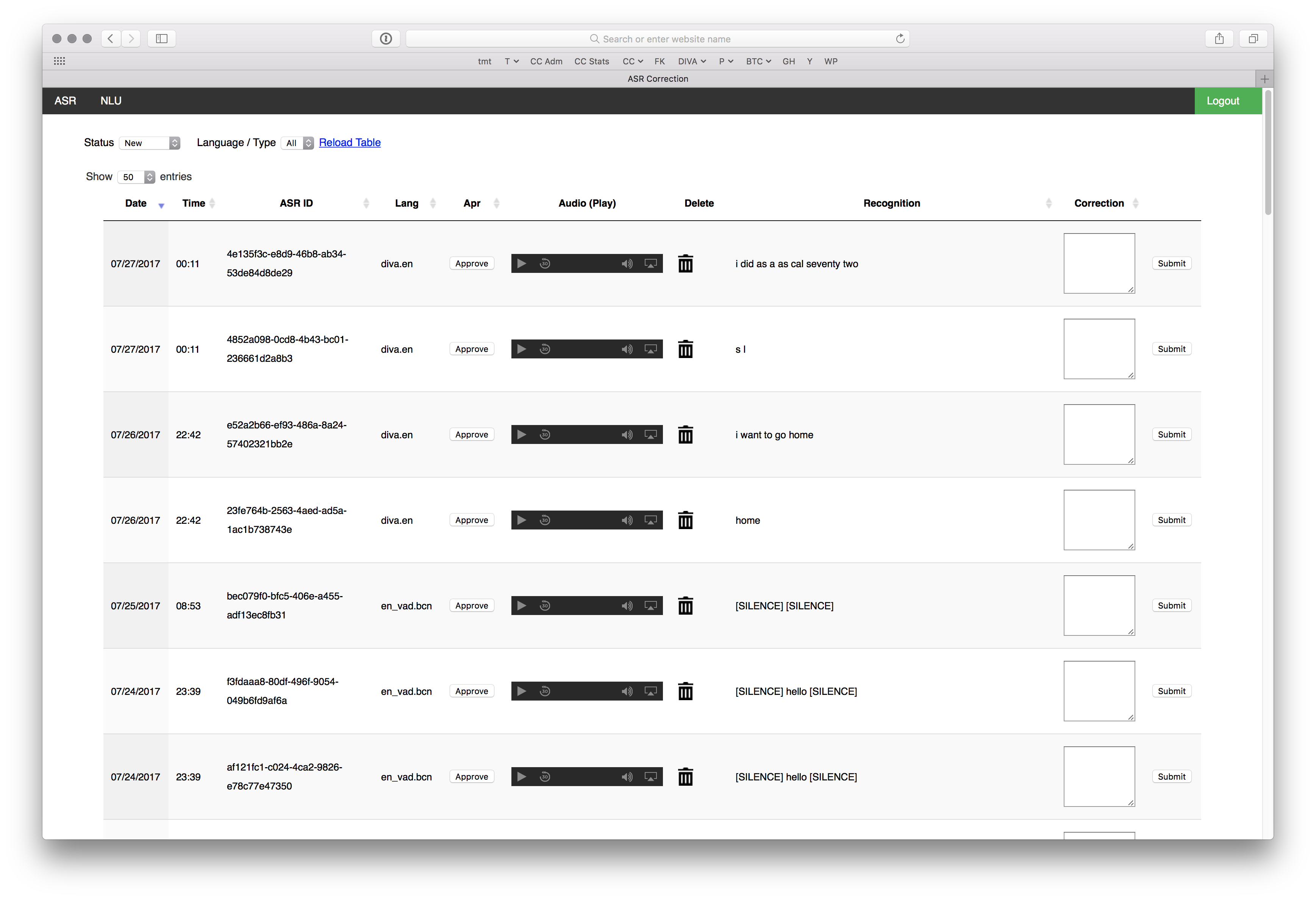 A simple portal to correct the audio utterances
Quality Assurance & Data Collection
To improve our recognition quality and our NLU, I worked with a remote quality assurance team on the US East Coast. We had several goals:
- Use DIVA to search for products and refine the search, so we can draw conclusions about how people would use voice in e-commerce.
- Check the quality of the speech recognition, and whether the intent was recognized.
- Research e-commerce data (such as brands, colors, etc.) for the speech recognition vocabulary. Our QA team member would join one telephone conference call to tell the team how we were performing.
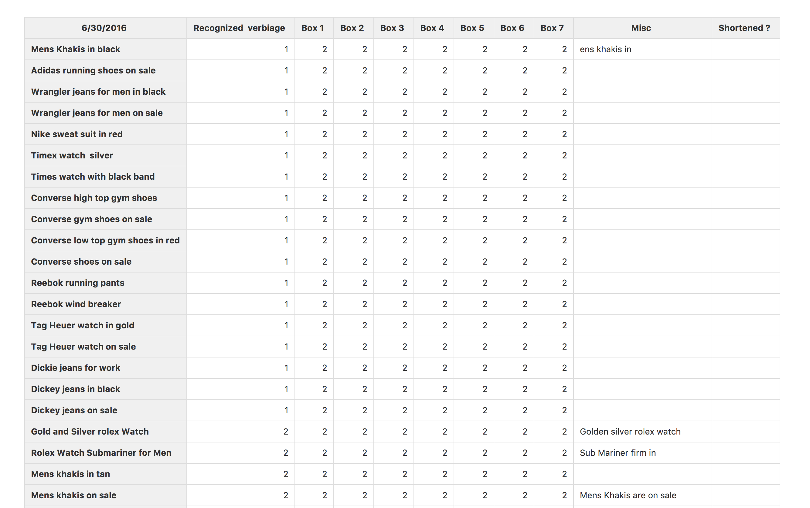 Working close together with QA team
Test in the Wild
I believe that a product benefits the most when all team members participate in usability tests and see what works and what doesn’t. Jared Spool, who has decades of experience in the field, states in his article Fast Path to a Great UX – Increased Exposure Hours
“Exposure hours. The number of hours each team member is exposed directly to real users interacting with the team’s designs or the team’s competitor’s designs. There is a direct correlation between this exposure and the improvements we see in the designs that team produces.”
With a remote team and limited resources, this was hard to implement. To give the team at least a bit of usability testing feedback, I tested DIVA in the wild. Whenever I went to a conference or meetup in the Silicon Valley, I demoed DIVA and asked people to try it out in front of me. Though most team members didn’t have any experience with usability testing, I asked them to do the same. This was not a structured usability test with researchers, but the feedback was very valuable. We learned a lot of things from these small exposure times.
- People hold the mic button pressed when they speak. Siri does support that behavior. The Google Assistant doesn’t. We didn’t realize we should support that behavior also, until we figured out that we should.
- People didn’t always recognize the green dot as a mic button. First, we added a little “Tap to Speak” tip that would be shown if no action was taken. Later, we added an icon to the button. It was especially important when we added image recognition capabilities to DIVA.
![]() On the left is the old and on the right the improved start screen
On the left is the old and on the right the improved start screen
Hands-Free Orders
One of our premises was to make DIVA a hands-free interface. You should be able to talk to it, “Okay, I want to buy it” or “Please go back” or “Show me the first one.” To implement that functionality, we programmed our NLU to interpret these orders and send them back to the client. The idea was that DIVA could be an interface in a TV, or the user could be in a situation where she only could speak and couldn’t touch the device.
Here you can see that we included numbers on the product list view. Now, would you want to have an ever-ongoing numbering for the products that you are showing? “Show me the 33rd one”? That’s not the best idea, and it would make the recognition more complicated. Together with the iOS engineer, we thought of just displaying the numbers when the user isn’t scrolling. And in this case, we could limit it to the number of products that are shown on the interface. The drawback of this approach was that the product list always needed to lock in, meaning if the user would display only half a product, the list would scroll up or down automatically. It worked. Later, we took that functionality out for the DIVA iOS client because people had DIVA in their hands, and the hands-free situation didn’t occur too often.
Thumb Orientation leads to Certain Design Decisions
The DIVA client is an app on a handheld device. If you are a designer, you might have seen this graphical representation from Luke W’s article “Designing for Large Screen Smartphones”, which shows that we interact mainly with our thumbs. The better an app is designed toward the thumbs, the better the usability is.
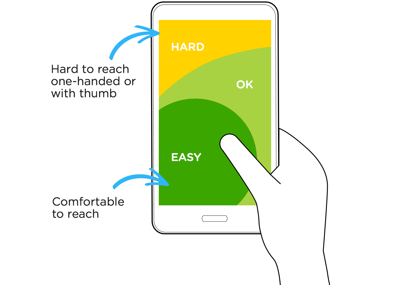
One of our features was the filter bar. The idea is that the attributes for a product come from the NLU knowledge base. In its functionality, it is similar to the filters that are shown in e-commerce apps. Filters are normally placed in the upper right corner.
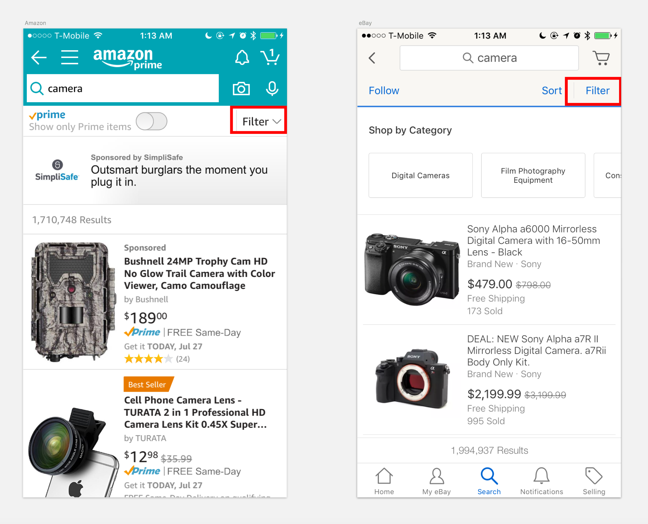 Features like filters in apps are visually present
We thought that this interaction paradigm wasn’t the best solution for a thumb-oriented design. Therefore, we developed the filter bar. It was inspired by the pill-shaped buttons that were shown in other chat-based bot applications. We developed it a step further, making it possible to easily access more than just three or four options.
Designing & Workflow
To organize my thoughts I use post it notes.
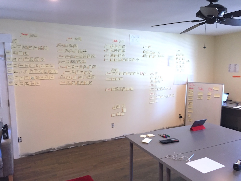 Post it’s are a designers best friend :)
To design the interfaces I use Sketch.
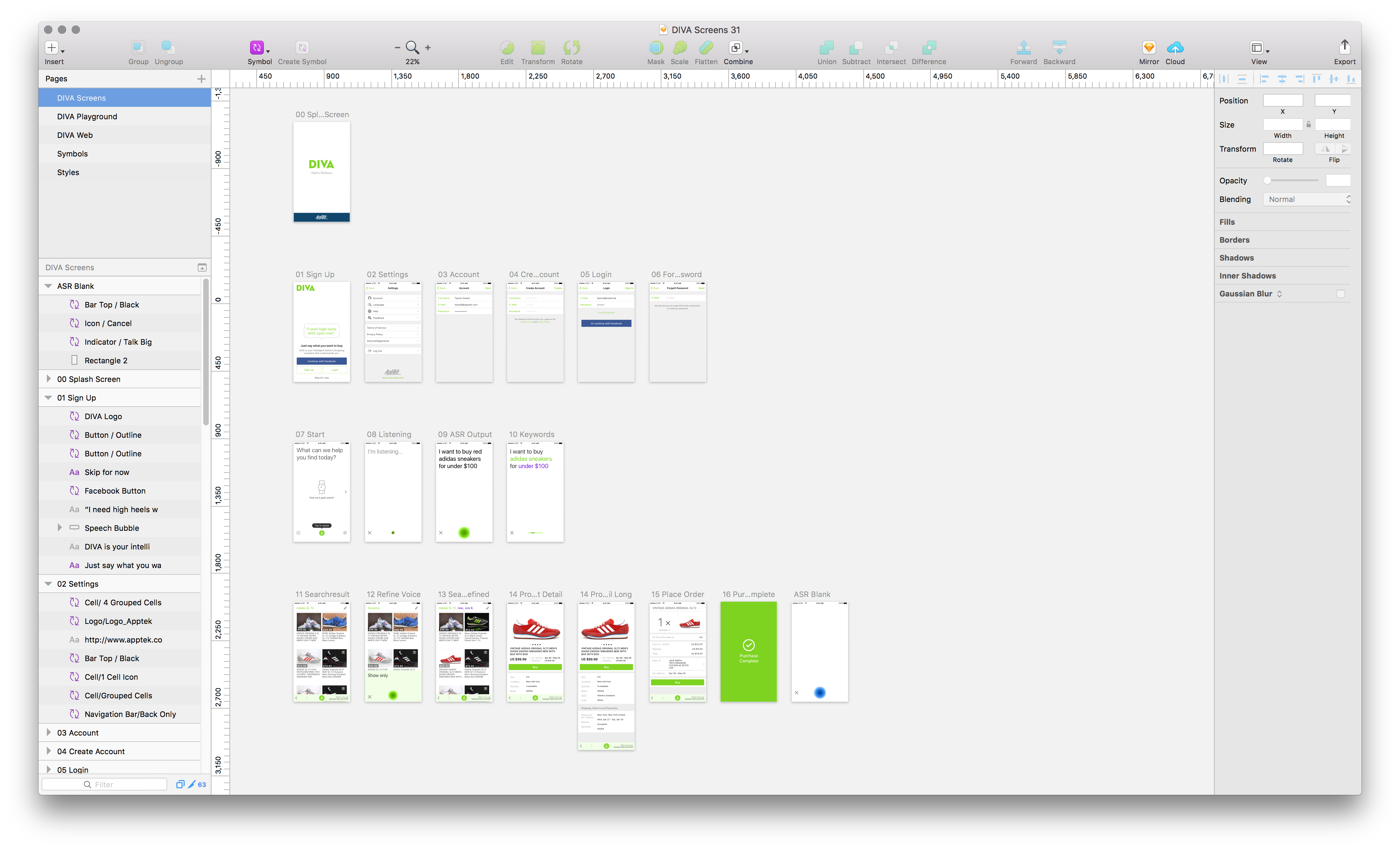 Sketch rocks!
To communicate the design specifications, I used a very simple annotation style for the developer.
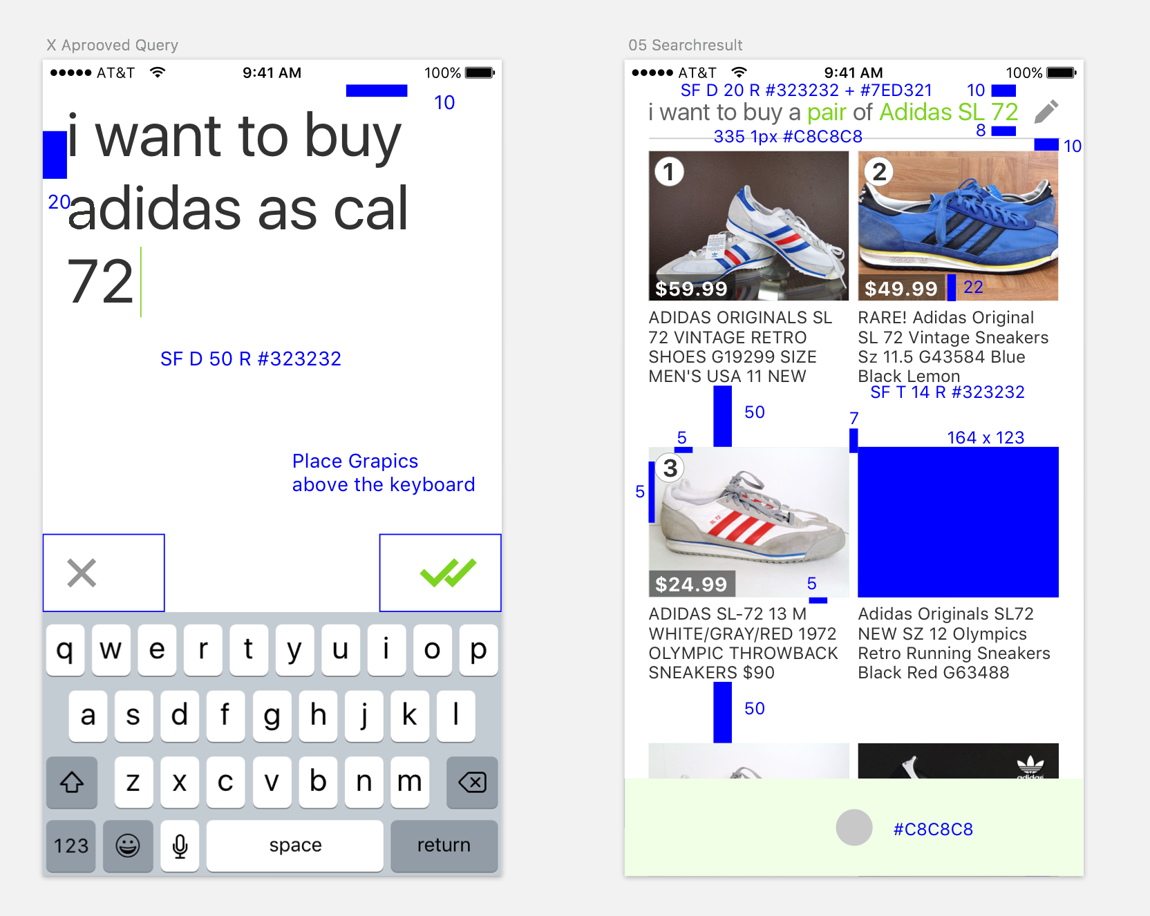 Initial way to communicate measures with the developer
Later, we implemented the tool Zeplin in our workflow, which made the process better for everybody. You just upload specific designs directly from Sketch and the dimensions and images can be downloaded directly from Zeplin.
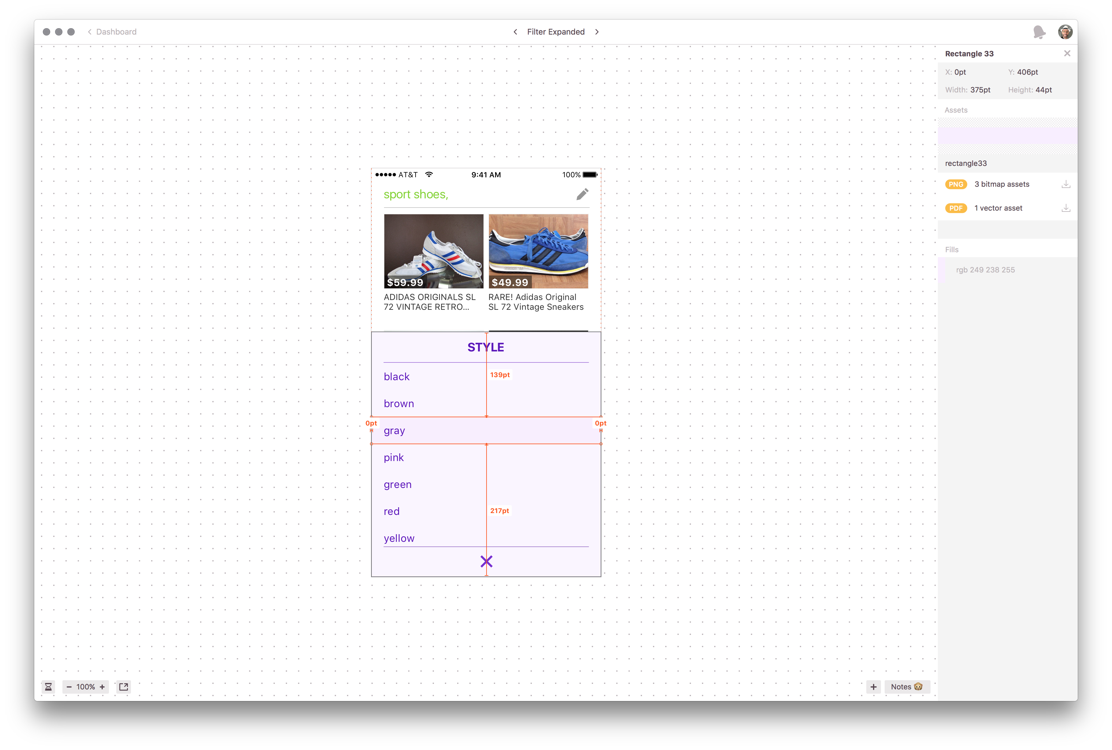 Later Zeplin made the workflow much smoother
Protoyping
There is no way of checking out if an interaction works well other than prototyping it. The quicker you can experience the interaction, the faster you can decide if it is a good one. For creating flows or testing out interactions I was using Flinto. I also used other prototyping software such as Marvel, Principle, or Framer but stuck with Flinto for most cases because it was able to generate the quickest output that I needed.
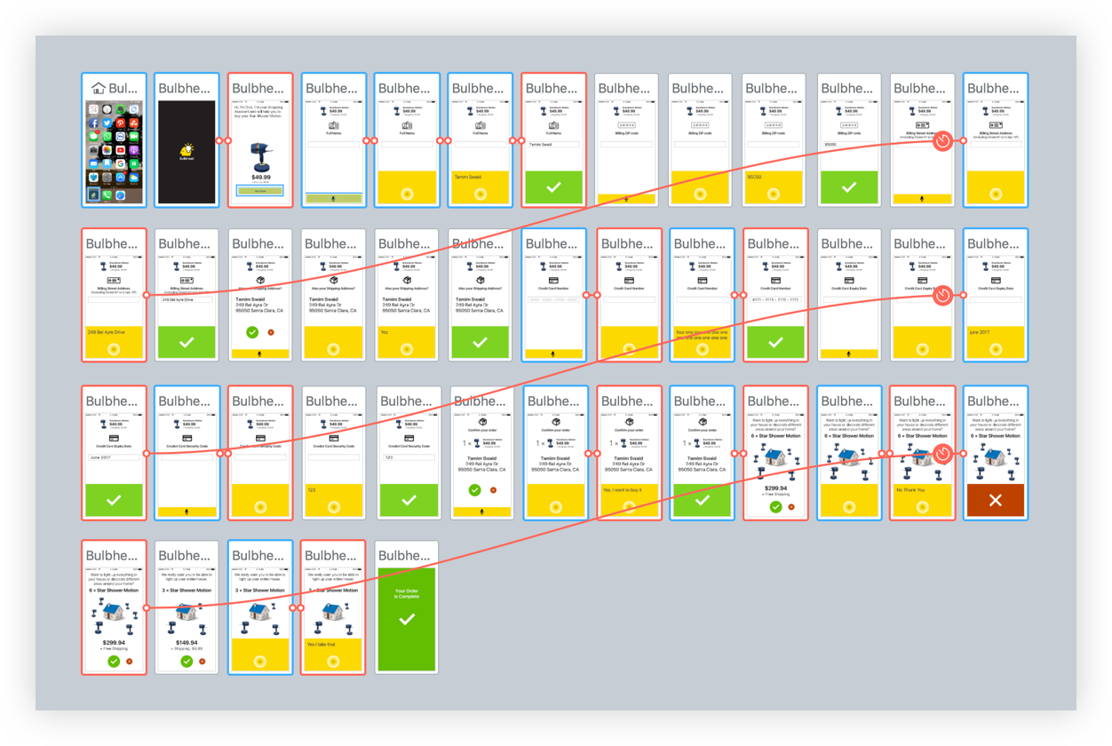 Overview of an interactive prototype built with Flinto
The Dirty Work
In every project there is the dirty work that needs to be done. Things that are tedious and take time. We had a couple of those tasks. Whenever it was possible, I coordinated with people who outsourced that work. But when it wasn’t possible, I did it myself.
- Transcribing: Approving and correcting recorded audio utterances.
- Correcting computer-generated phonemes: For example, if you say “USA,” you actually say “YOU ESS AY.” If you give the word to a computer to generate the phoneme automatically, it might generate it as a word (USAH), and not as single letters. Those computer-generated phonemes needed to be rechecked to improve the speech recognition.
- Cleaning data: When data is scraped for training models it is dirty, especially when the data is user-generated. This means there is data you don’t want to have there. Between pictures of laptops, you may find boxes of laptops. The data needs to be cleaned up.
Speechtek 2016
In May 2016, we went to the Speech Technology Conference “Speechtek”. It was a good time to show what we were working on. Here are the slides that I presented.
The Launch
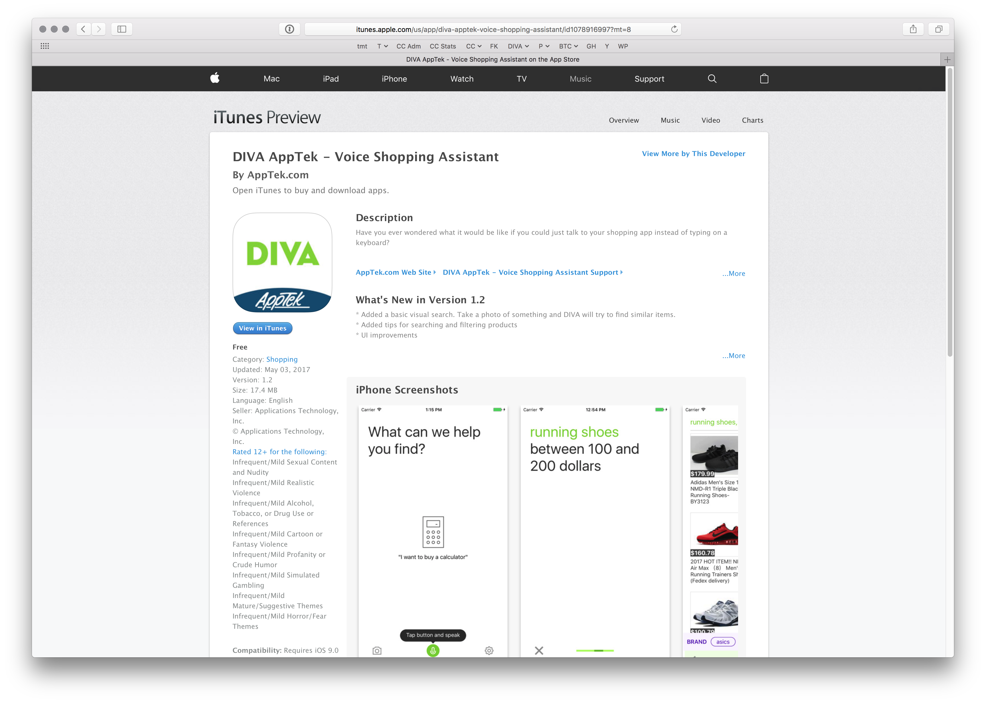 Launch of DIVA after eight months
After eight months, we launched DIVA on the Apple AppStore in an Alpha stage. To give users a real benefit in trying out DIVA, we connected it with the eBay API and later with the Amazon API. Then users could search for a product, see it, and then open it in the web browser. The integration was a challenge in itself. Often we had to figure out how we had to structure the API calls to get the data we wanted. In some cases, we were not able to obtain the data in the way we needed it. Nevertheless, we wanted to get our product out in the wild and have people test it and play around with it. The initial idea was to make a purchase possible via voice. That wasn’t possible since the eBay API integration for that was too time-consuming.
Custom Apps
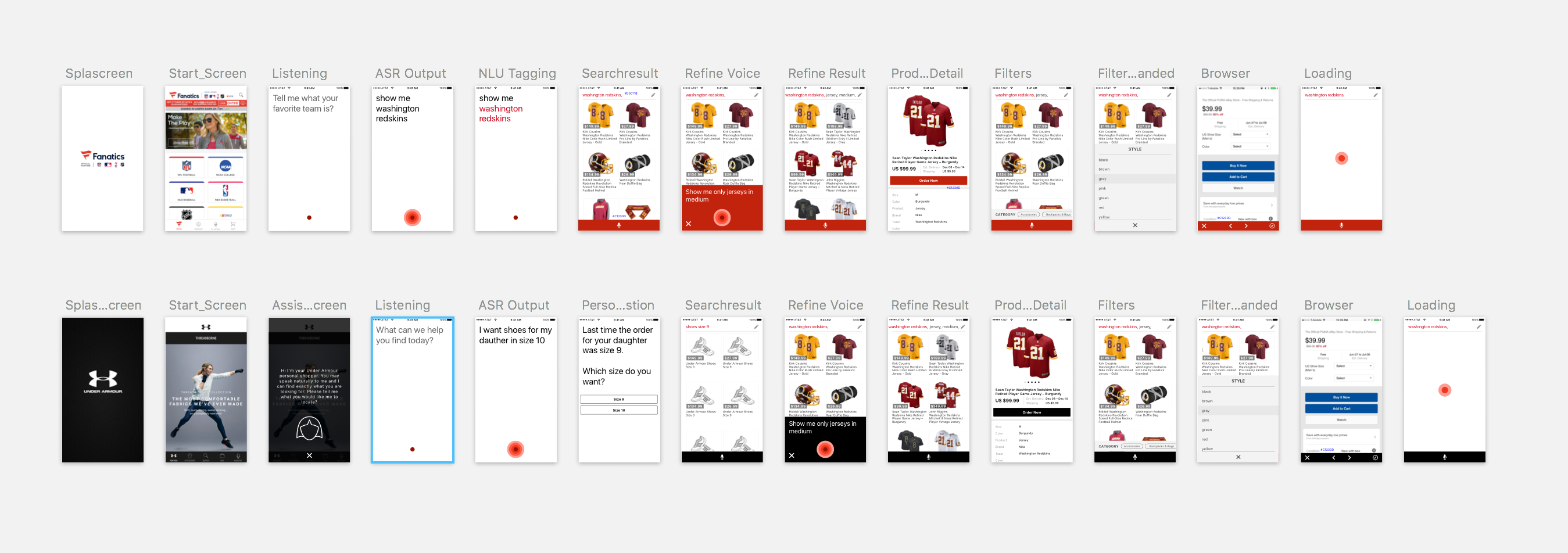
To demo the technology, we generated custom apps. DIVA’s design was simple and easy, skinable. This enabled us to generate these apps with customed data in a very short amount of time.
Image Recognition
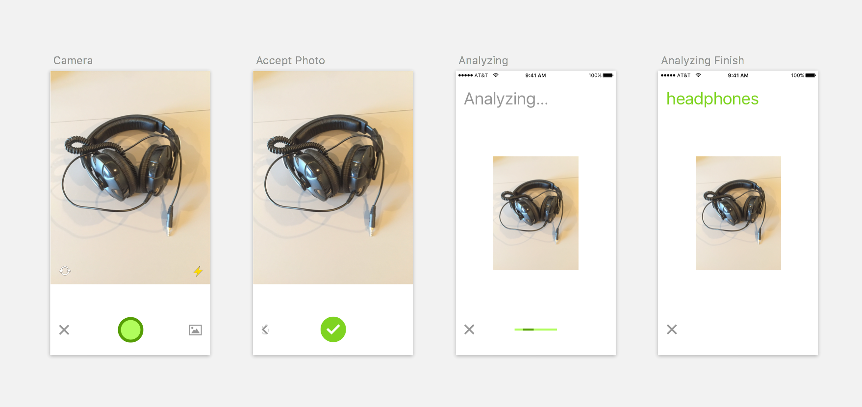 Simple user flow for image recognition
Having the application in the wild, we wanted to implement image recognition as another feature. The idea was that people could search for products by making a photo. While the team was gathering training data and building the models, I researched similar services and apps that offered a visual recognition service. I also checked the user flow of photo apps for taking a photo. With the best from both worlds, I designed a simple flow and added a camera button to the start page. When the prototype looked good and the image recognition technology was in place, we implemented the technology in the iOS client. Although we knew that the recognition technology needed to be improved, we wanted to learn how people would use such a feature.
Retrospect and Outlook
DIVA is a bold move for a small company like AppTek. Myself as an individual, we as a team, and the company as a whole, are learning a lot. With voice interaction becoming more and more important in the future, AppTek is showing that its technology is able to be part of a voice assistant. For a small company, it is an amazing start in that promising space.